Introduction
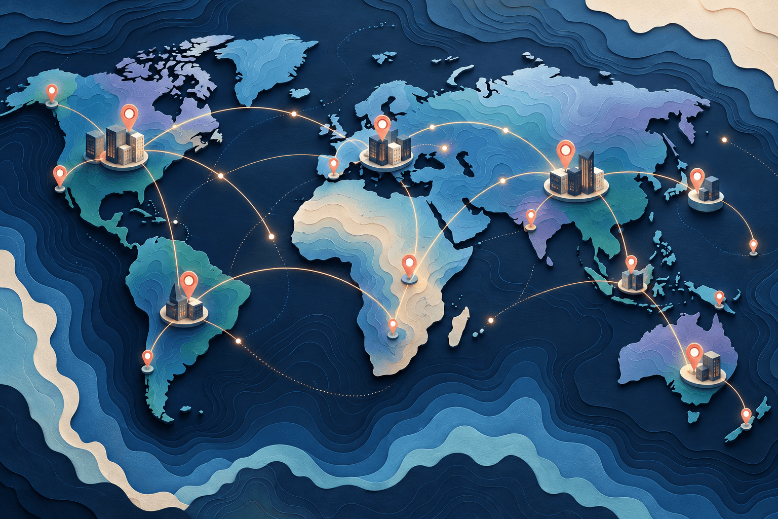
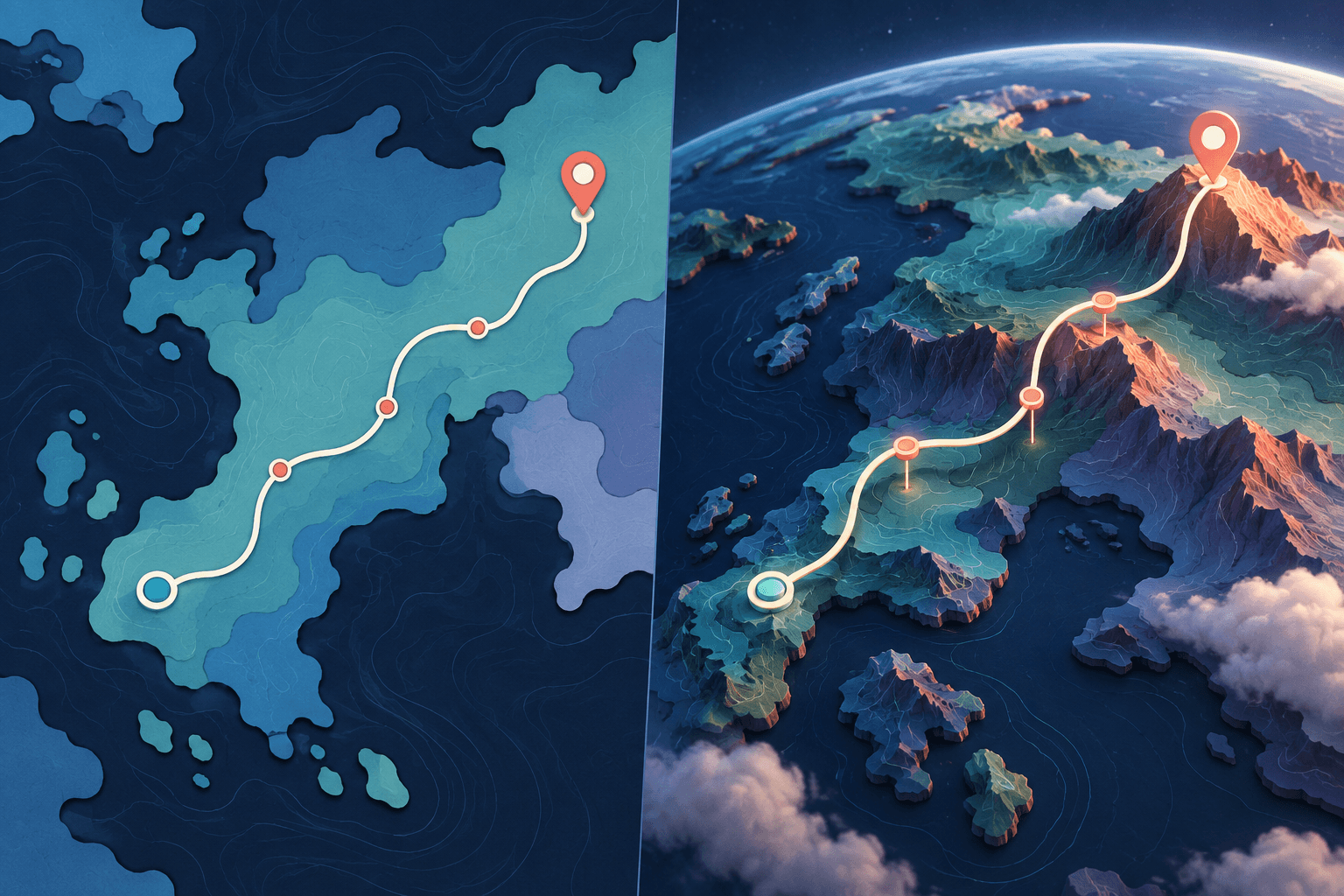
The choice in 2D vs 3D map animation is not a contest between basic and professional. It is a decision about what the viewer needs to understand. A flat overview may make a route easier to compare. A three-dimensional view may help explain terrain, height, or the approach to a place.
Esri's explanation of mapping in three dimensions describes the shift from a map to a scene with another spatial dimension. For video planning, the practical question is simpler: does that additional viewpoint clarify your story, or distract from it?
For a project built around locations and media, explore AlbumMap. Choose the visual treatment after you know what each scene needs to communicate.
Separate map style from camera movement
Several choices often get bundled together: flat versus three-dimensional presentation, illustrated versus photographic appearance, and a fixed versus moving camera. Treat them separately.
A top-down map can still zoom and pan. A globe can remain almost still. A satellite-looking background does not automatically make every layer three-dimensional. Likewise, a dark theme changes appearance but does not decide how the audience understands distance or sequence.
Before choosing a style, complete this sentence:
The map needs to show the viewer ______.
“The order of three stops” suggests a different design from “how the route crosses mountainous terrain.” The first may need a clean overview. The second may benefit from a view that reveals the landform.
When to start with a 2D map
Start flat when comparison and readable labels matter more than a dramatic approach. A fixed overview lets you give the same attention to several locations without moving the camera between each one.
This is a useful starting point for a short itinerary, a sequence of offices, a classroom location exercise, or a route with tightly grouped stops. Keep the frame stable while changing one element at a time: a marker, a line, or a label.
A 2D design still needs care. Too many labels can overlap, and a dense route can become difficult to follow. Do not treat a flat map as a reason to fit every detail into one scene. Use chapters or a second close-up when the information needs more room.
Try this test: pause the opening frame. Can a viewer understand what area is shown and what the important points are? When the answer is no, simplify before adding motion.
When to consider a 3D view
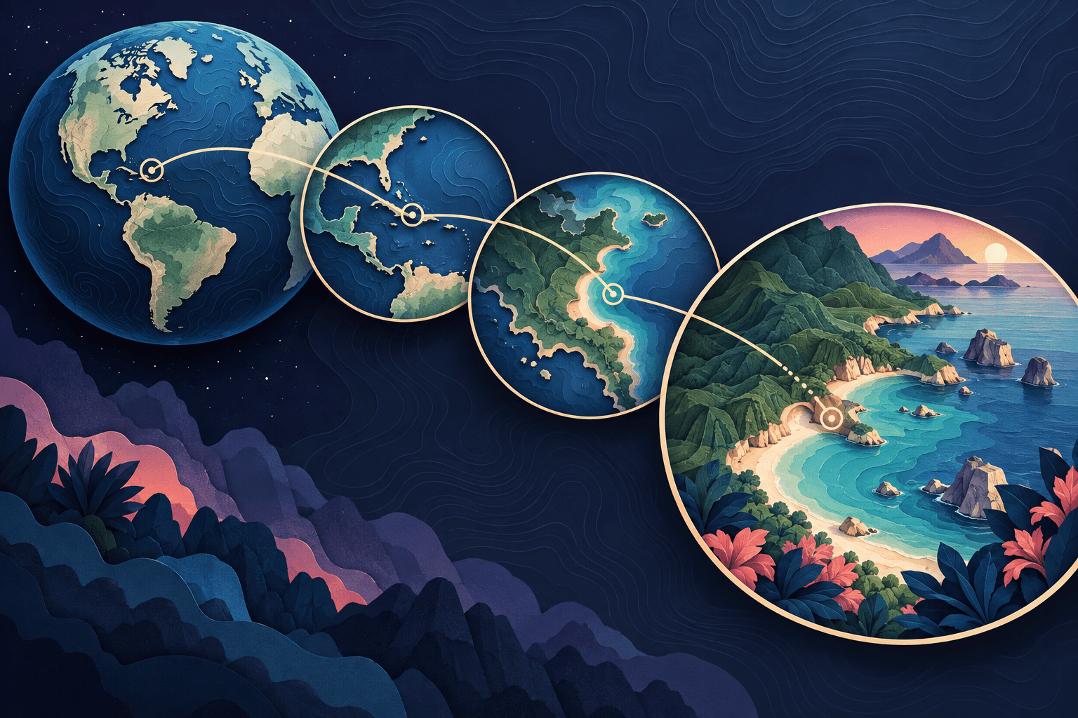
Consider 3D when the viewpoint itself adds meaning. A route that crosses a ridge, an approach toward a public landmark, or a globe-level connection may benefit from a sense of spatial context.
Begin with a restrained camera angle. Check whether near objects hide distant labels and whether the route disappears behind terrain or the globe. A visually impressive frame can still fail as an explanation.
Use the approach to establish the place, then let the camera settle. A stationary final view gives the audience a chance to connect the geography with the following photo, clip, or caption.
Do not add height or terrain simply to imply technical accuracy. The animation is only as dependable as the data and imagery behind it. Decorative geography should not be presented as a measurement or a navigation resource.
Compare the styles with the same small storyboard
A fair comparison uses the same locations, labels, duration, and message. Otherwise, you may be reacting to different content rather than the map treatment.
Imagine a fictional route connecting a starting point, a ridge stop, and a lakeside finish. Make two short versions:
| Story moment | Flat-map version | Three-dimensional version |
|---|---|---|
| Establish the journey | Show all three points from above | Begin wide enough to orient the viewer |
| Explain the middle section | Highlight the relevant leg | Use a gentle tilt to reveal the landform |
| Show the main stop | Pause on a clear marker and label | Settle the camera so the marker is not hidden |
| Finish | Keep the complete route visible | Return to an overview that shows the relationship between stops |
Ask a reviewer to describe the journey after watching each version once. Which version makes the key point easier to explain? That question is more useful than asking which one feels more cinematic.
These are illustrative design exercises, not claims about a real route or measured learning outcomes.
Use a hybrid when each view has a clear role
You do not have to commit the whole video to one treatment. Start with a flat overview, use one short spatial approach, then return to the overview for the summary.
Keep visual rules consistent across the change. Use the same names and marker meanings. Preserve enough context that the audience understands they are looking at the same locations from another viewpoint.
Avoid changing the map style, camera direction, label system, and music emphasis at the same instant. The style change should help explain a new scale or part of the story, not make the viewer re-learn the whole map.
For a practical editing example, see map zoom transitions for travel videos.
Choose colour and detail after choosing the view
A calm map with one strong route can be more useful than a detailed map with competing roads, labels, buildings, and photographs.
Choose a limited visual hierarchy. The active location should be easy to identify. Supporting geography should remain visible without looking equally important. A caption should not cover the very landmark it describes.
AlbumMap's homepage examples show several visual map treatments. Use such choices to support the story's mood, then check the same route in a less detailed view as a clarity test.
For public content, make sure a route can be followed through labels and sequence, not just a change between two colours. Keep a static overview available when it helps viewers review the information.
Give movement a purpose
Each camera move should reveal something, connect two ideas, or establish a new scale. Repeated movement without new information can compete with the material you are trying to show.
For a photo stop, stop moving long enough for the image to register. For a location comparison, hold the overview. For a terrain explanation, choose a viewpoint that reveals the relevant feature rather than circling it without a plan.
On websites, consider people who prefer less motion and provide appropriate playback controls. W3C's animation guidance explains why non-essential interaction-triggered animation needs care.
Start with clarity, then add atmosphere
Build the simplest version that explains the locations. Add depth, detail, and movement only where they improve that explanation. To turn a set of places into a media-led journey, create a map video in AlbumMap.
Helpful answers
Frequently asked questions
Is 3D always more accurate than 2D?
No. Dimensional appearance and data accuracy are different questions. Verify the underlying locations, dates, geometry, and measurements regardless of the chosen style.
Which style works better for vertical video?
Test both with the real route. The important constraint is whether the locations and labels fit the composition. A wide route may need multiple scenes in either style rather than one crowded vertical frame.
Can I mix a flat map with a globe view?
Yes, as an editorial choice. Give each view a role and preserve consistent labels so the change in perspective does not break the story.
Should I use satellite imagery for every travel video?
Not necessarily. Choose imagery when its detail is useful and its permitted use fits your project. A simpler map may provide a clearer background for route lines, photos, and captions.